Why graphic design matters for affiliate WordPress themes
Great graphic design does more than make a site look attractive — it guides attention, builds trust, and improves conversion rates. For affiliate websites built on WordPress, the visual system (colors, typography, imagery, layout) directly affects how visitors perceive product recommendations and whether they click through or bounce. This post covers practical, modern graphic design strategies tailored to affiliate themes so your WP-affiliate-theme.com projects convert better while staying visually cohesive.
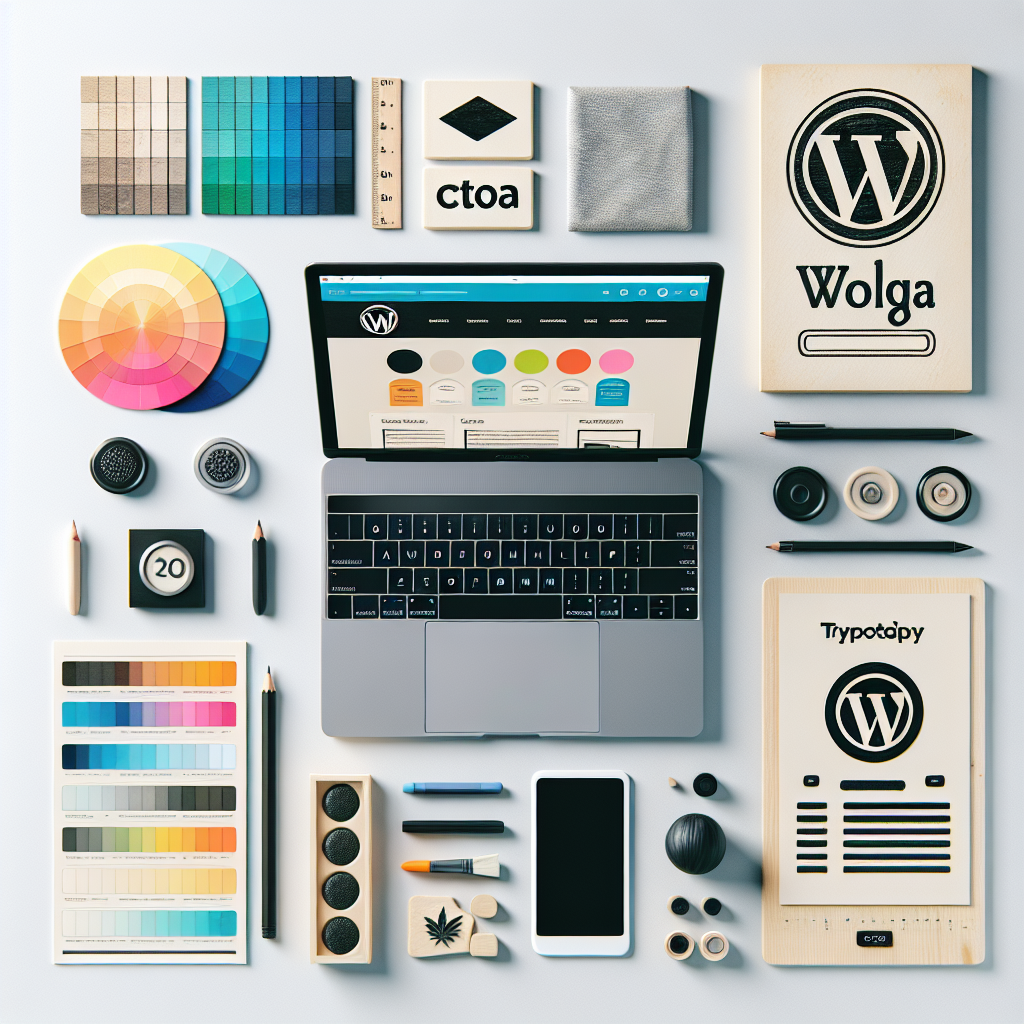
Foundations: Visual hierarchy, typography, and color
A strong visual foundation makes content scannable and persuasive. Focus on three pillars:
1. Visual hierarchy
Use size, weight, color contrast, and spacing to prioritize elements. Headlines and calls-to-action should stand out; secondary details like price comparisons, product specs, and trust badges should be clearly placed but visually subordinate. A consistent grid system keeps layouts predictable and comfortable for users.
2. Typography
- Choose readable font pairs: a distinct display font for headlines and a neutral, legible font for body text.
- Use variable fonts or system fonts to reduce load time while maintaining typographic expressiveness.
- Set clear line-height and responsive scale so type adapts cleanly across devices.
3. Color and contrast
Color influences emotion and action. For affiliate themes, select a palette with one dominant brand color for CTAs and accents plus neutral backgrounds that make product images pop. Always check contrast ratios for accessibility — good contrast helps everyone, and it improves click-through rates on CTAs.
Design patterns that boost affiliate conversions
Beyond basic aesthetics, certain design patterns are proven to increase engagement on affiliate sites.
Hero section with clear value
Top-fold content should immediately communicate what the page offers and why the recommendation matters. Use a concise headline, a supporting subheadline, and a single primary CTA. Consider a small trust-line (reviews, expertise) near the CTA to reduce friction.
Product imagery and context
- High-quality product photos or lifestyle images increase desire. Use consistent image ratios and consider subtle shadows or soft frames to create separation from the background.
- For niche affiliates (collectibles, outdoors, tech), include contextual images — for example, a collector guide can benefit from detailed shots. See a relevant example of how niche product pages present collectibles with strong visual appeal: special coins.
Comparison tables and scannable content
Affiliates often rely on comparisons. Design comparison tables that use clear headers, alternating row backgrounds, icons, and an obvious primary pick. Mobile-friendly collapse/expand behaviors keep tables usable on small screens.
UI elements: Buttons, badges, and microcopy
Small elements have big effects:
- Buttons: Make primary CTAs high-contrast, large enough for easy tapping, and labeled with action-first microcopy (e.g., “Buy on Store”, “Check Price”).
- Badges: Use verified purchase, expert pick, or award badges near top recommendations to boost credibility.
- Microcopy: Short, reassuring text under CTAs (e.g., “No extra fees”) addresses common objections.
Performance and modern formats
Visual design must be fast. Slow pages reduce conversions regardless of aesthetics.
- Optimize images: Serve WebP/AVIF where supported and use responsive srcset images.
- Use SVGs for icons and logos — they scale crisply and are lightweight.
- Defer non-critical scripts and inline critical CSS for faster first paint.
Accessibility and inclusive design
Accessible design widens your audience and aligns with modern best practices. Ensure:
- Color contrast meets WCAG standards.
- Buttons and links are keyboard-focusable with visible focus states.
- Images include descriptive alt text — helpful for search and screen readers.
Branding for affiliate themes: consistent systems
Affiliate sites often promote multiple products across niches. A reusable design system keeps brand cohesion while allowing pages to present diverse products. Document color tokens, spacing scales, button styles, and component rules so theme templates stay consistent as content grows.
Testing and iteration
Design decisions should be validated with data. A/B test headline treatments, button colors, CTA placement, and product image styles. Use heatmaps to see where users focus and funnel analytics to measure the impact of visual changes. If you’re new to monetization tactics, start with guides like How to earn money on affiliate marketing to align design experiments with business goals.
Where graphic design theory meets practice
If you want a concise primer on the discipline that informs all of the above, the foundational definition is available here: Graphic design. Turning those principles into a theme requires attention to performance, user psychology, and the specifics of affiliate conversion flows.
Checklist: Quick design audit for affiliate themes
- Headline clarity — Does the hero state the benefit?
- CTA prominence — Is the primary action visually dominant?
- Image quality — Are product images consistent and optimized?
- Trust signals — Are reviews, badges, or data visible near CTAs?
- Mobile usability — Are tap targets, tables, and layouts responsive?
- Loading speed — Are images and assets optimized for performance?
Final thoughts
Graphic design for affiliate WordPress themes is a blend of art and science. By combining strong visual hierarchy, purposeful imagery, accessible patterns, and performance-aware assets, you can create affiliate experiences that look great and drive results. For theme makers and site owners on WP-affiliate-theme.com, design is the conversion engine — invest in it, test it, and keep iterating.